Building and visualizing a decision tree classifier
A decision tree is a powerful tool that use a tree-like structure to help make decisions. At each node of the tree, the different branches correspond to the different possible values that the feature/attribute can take. Decision trees are well-suited for certain types of machine learning problems where the path towards the final answer involves traversal along different ‘branches of a tree’. The basic idea of traversing a decision tree to make a decision involves traversing branches of the tree such that the information gain in increased. In other words, the paths are decided at each node such that the expected value of a particular outcome increases. The major advantage of decision trees is that they are intuitive and are easy to interpret. They also serve as reasonably accurate machine learning algorithms for certain problems.
In this post, we will look at a sample dataset, build a decision tree classifier and (here’s the fun part) visualize the decision tree. We will use the popular heart disease diagnosis dataset. As usual, we will first read in the data using pandas.
import pandas as pd
feature_names=["Age", "Sex", "Chest pain type", "Resting blood pressure",
                          "Cholesterol", "Fasting bloodsugar", "resting electrocardiographic results",
                          "maximum heart rate achieved","exercise induced angina",
                          "ST depression induced by exercise ", "slope of the peak exercise ST",
                          " number of major vessels (0-3) colored by flourosopy",
                          "Thalassemia","Label"]
target_names = ["High risk","Low risk"]
data = pd.read_csv('heart.csv',header=0,
                   names=feature_names)
X = data.iloc[:,0:13]
y = data.iloc[:,13]
Note that we are also defining descriptive header names (which we will use later during the visualization step). Once we have the X and y values, we can construct a Decision tree to this data.
from sklearn.tree import DecisionTreeClassifier
dtree=DecisionTreeClassifier()
dtree.fit(X,y)
That was straightforward. We fitted all the data to a classifier. Note that we could have also used a DecisionTreeRegressor at this step, if our goal was regression (duh!).
from sklearn.externals.six import StringIO
from IPython.display import Image
from sklearn.tree import export_graphviz
import pydotplus

dot_data = StringIO()
export_graphviz(dtree, out_file=dot_data,
                filled=True, rounded=True,
                special_characters=True,feature_names=feature_names[:-1],
                class_names=target_names)
graph = pydotplus.graph_from_dot_data(dot_data.getvalue())
Image(graph.create_png())
graph.write_png("HeartDiseaseDecisionTree_raw.png")
Now, the important visualization step for which we will use the pydotplus and the associated graphviz packages to do this. We have also specified the feature and class names that will be displayed in the tree below. The last line saves the tree as a png file. Shown below is the result.
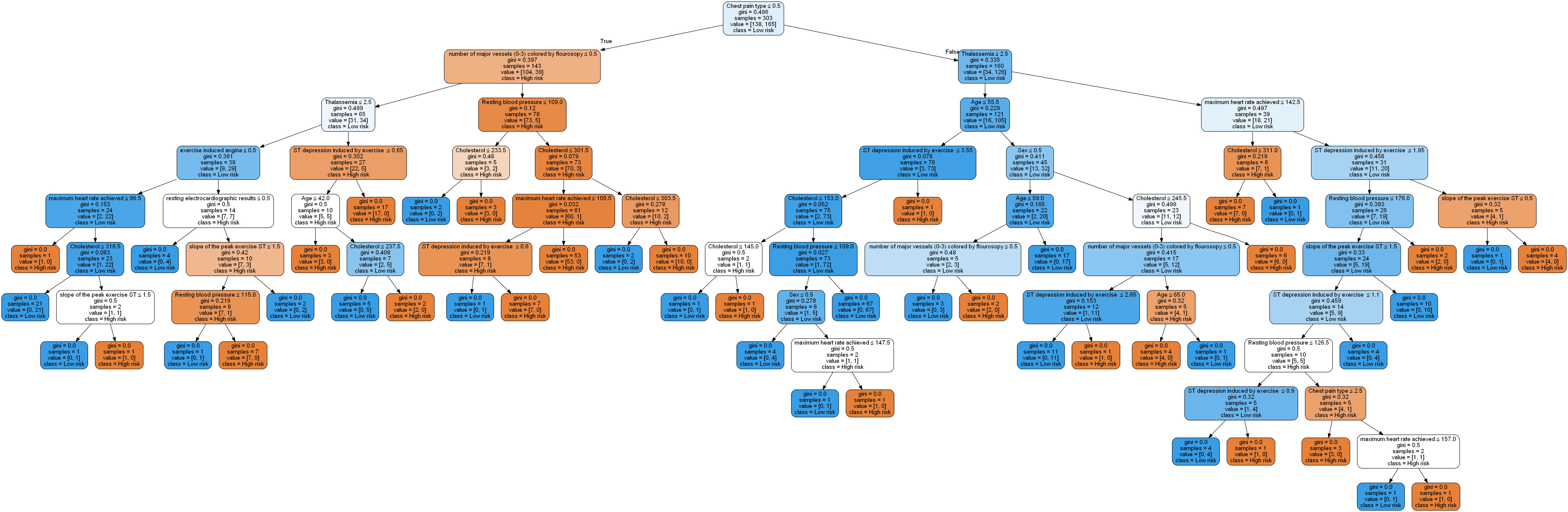
Well, that’s a bit of a mess really. It’s quite a complex graph/tree structure and such a model is not only difficult to visualize, but is very likely overfitting the data. One way to overcome this drawback is by pruning the tree. We can restrict the maximum depth of the tree to no more than say, 5 levels. We can achieve this by just adding the argument to the classifier call as below and repeating everything else.
dtree=DecisionTreeClassifier(max_depth=5)
This gives the following structure:
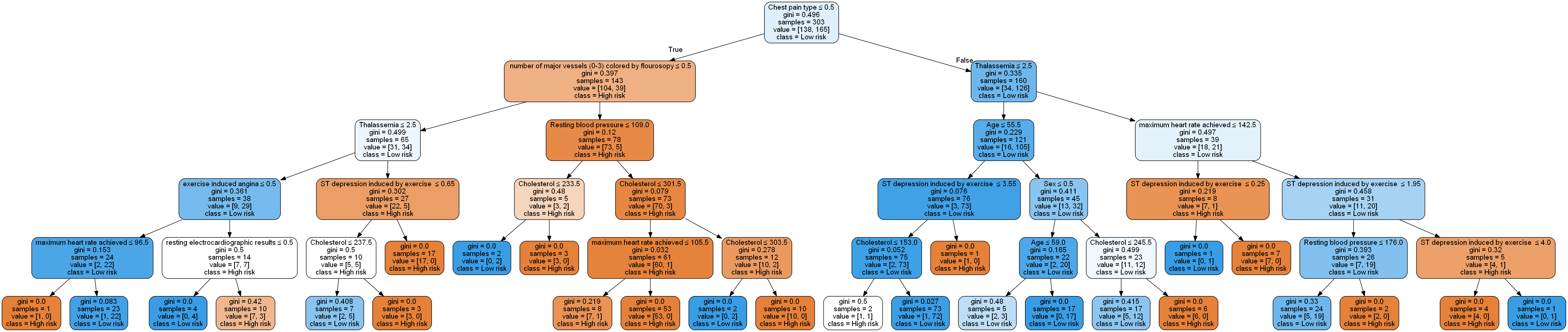
This is definitely easier to visualize (and the model will likely generalize better). We can zoom into some these branches to get a closer look:
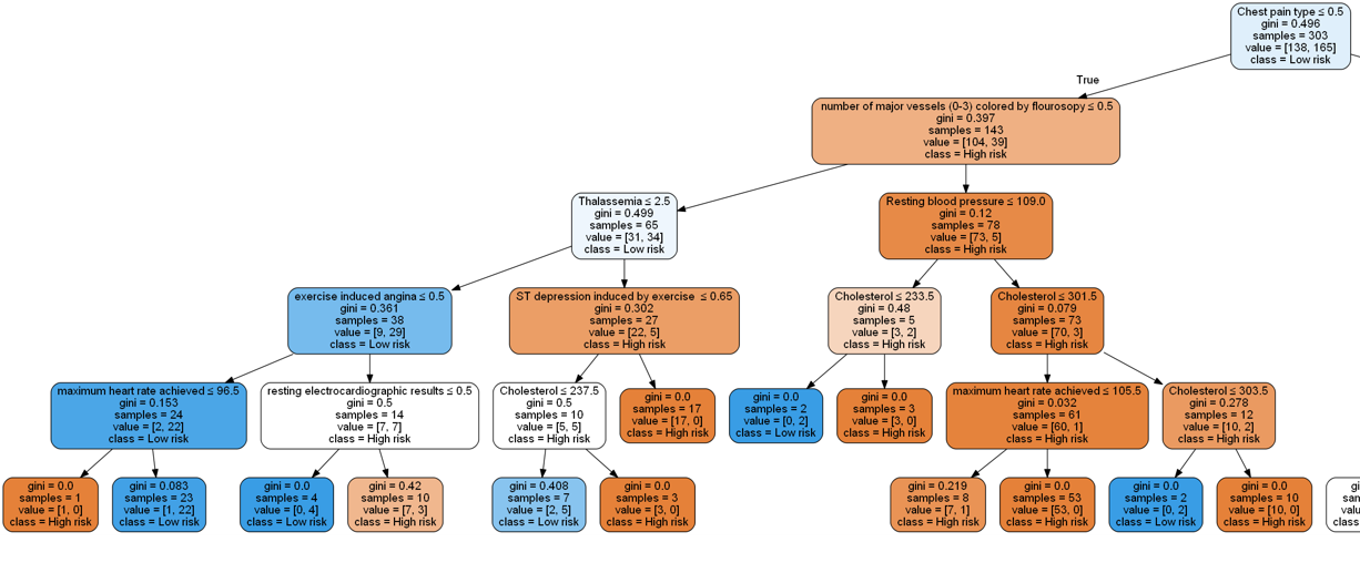
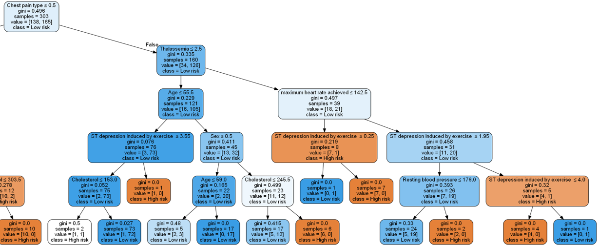
Note that when building a decision tree, we choose the attribute/feature with the least Gini index as the root node.
Visualizing our features in such a manner provides us with an intuitive understanding of feature importance.